There is no logo in the world that is more recognizable than the Coca Cola company’s flagship product. Coke and its classic bottle design are a symbol known all over the world. It’s gotten to the point you don’t even need to have the word Coke in an advertisement as long as the distinctive bottle shape is there somewhere in the image.
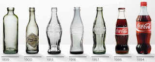
The classic shape has evolved over the last hundred years and has gone from a rather boring square shaped bottle to the curvy silhouette it now maintains. Below is a timeline picture showing the changes over the years.
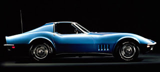
The shape is also responsible for designers of other products to be inspired by the sexy elements of the bottle, most notably car designers. there are many examples but one of the best is the 1968 Corvette.
The evolution of the bottle continues with many commemorative issues produced for various promotions but one of the latest trends was the availability of metal bottles as well.
There is no doubt the bottle will continue to evolve and change slightly as time goes on but it’s not likely to change to something completely different. Makes no sense to change something that is so loved and part of the culture and identifiable as a classic Coke bottle design. That would be dumb – if you’re going to do that you may as well change the formula and come out with a New Coke………. oh wait, never mind.


